Hola, I'm Natalia Rojas
HW/SW Design Prototyper, Creative Coder
Nice to meet you!
How about you?
Let me guess...
HW-UX Design specs for Echo Frames Gen3
As Direct Responsible Individual (DRI), I was accountable to define HW-UX specs for HW input and output modalities bridging between UX Design team and Engineering + Manufacturing teams. I focused on design specs, validation, calibration for Hall Sensor to Power On/Off, LED/ALS on frames, Buttons force and latency, Proximity sensor.
Designing specs for HW requires to understand both User Experience and Technology. I dedicated 1+ year to find the right configuration for components, make sure they were calibrated for an optimal user experience balancing different conditions such as head shape, fingers size, lighting, weather, SKUs, customer needs and expectations. Worked with Firmware establish protocols and reach the granularity for the specs to be code-able.
Have a glimpse into how I work!
Have a glimpse into how I work!
Workspace


LEDs


Proximity Sensor


Hall Sensor


Buttons Latency

Ambient Light Sensor (ALS)
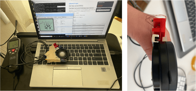
After developing ~100 quick prototypes for:
1. Exploring new HW features
2. Designing HW-UX specifications
3. Conducting UXR studies
4. Validating HW components for each factory build,
I achieved a green (Customer Satisfaction Score of 5.5 or higher out of 7.0) on all the HW-UX features I drove for Gen3: Hall Sensor to Power On/Off, LED/ALS on frames, and Buttons force and latency.
After exhausting configurations, the proximity sensor component, however, did not meet the UX bar and the workstream was cancelled.
URL: Echo Frames (3rd Gen)
Tasks: Design Technologist
Technologies: HTML, JavaScript, CSS, jQuery, Python, Pydbg, WebSocket, D3.js, Kotlin, Android Debug Bridge (ADB), AWS Gateway API, MongoDB, Lambda.
Year: 2022
Tasks: Design Technologist
Technologies: HTML, JavaScript, CSS, jQuery, Python, Pydbg, WebSocket, D3.js, Kotlin, Android Debug Bridge (ADB), AWS Gateway API, MongoDB, Lambda.
Year: 2022
Top Contact Gesture
Echo Frames 2nd Gen hero feature “Top Contact” allows customers to frictionlessly call or message their most important contact with a gesture on their frames.

The UX team was asked to recommend the gesture to trigger the feature. Considering that all the gestures on the frames were already assigned to other actions we knew this addition will imply 2 actions to share the same gesture being one of them by default, and the other one selectable in the Alexa App. We evaluated several options on (1) Reliability of the gesture in terms of accidental triggers (2) Usage of the existing feature (3) Level of education required for existing and new customers (4) Consistency with current gesture mapping mental model.
We narrowed down to two options: (A) Action Button (assigned to trigger Alexa) or (B) Touchpad Long Press (assigned to trigger OS assistant). To gain insights and preferences we ran an A/B UX Research Study for which I built a prototype on a real device.
We narrowed down to two options: (A) Action Button (assigned to trigger Alexa) or (B) Touchpad Long Press (assigned to trigger OS assistant). To gain insights and preferences we ran an A/B UX Research Study for which I built a prototype on a real device.
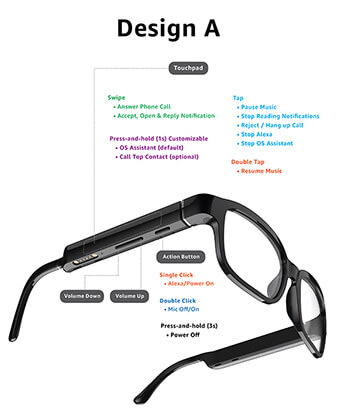
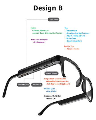
69% participants preferred using Touchpad Long Press over using the Action Button, but not as the default option.
The recommendation was backed with the following data:
• Audio based active customers in April 2021, 44.5% iOS - 14.6% Android triggered OS Assistant using Touchpad Long Press mostly once, and less than 5 users would use it more than 20 times a month
• Metrics on gestures usage showed Action Button Click (Alexa) is used 3x times than Touchpad Long Press
• Long press is less likely to be recognized as other gestures and be false triggered
• Education for new customers and backwards compatibility for existing customers would be straightforward
• Echo Frames is an Alexa product
Real customers are delighted by features’ ease of use, ability to quickly/conveniently make calls without the use of a phone. 95% of users did not experience any accidental triggers of the feature.
URL: Echo Frames (2nd Gen)
Tasks: Design Technologist
Technologies: HTML, JavaScript, CSS, jQuery, Python
Year: 2021
Tasks: Design Technologist
Technologies: HTML, JavaScript, CSS, jQuery, Python
Year: 2021
Real Time Births Map
The Bill & Melinda Gates Foundation hosts the annual event "Goalkeepers," bringing together policymakers and young entrepreneurs making a difference in the world. Bill Gates delivers a keynote speech, addressing global challenges and proposing solutions. In 2019, his theme was "Let's change the odds" highlighting the need to improve the lives of children born in disadvantaged countries.

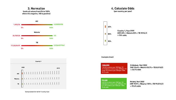
To support this theme I first calculated the odds (%) babies from each country have to thrive using the following factors: under-5 mortality rate, stunting rate, mean years of education. Those factors were weighted evenly, and the highest ranked country was colored the brightest green; the lowest, the deepest red.
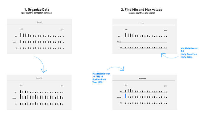
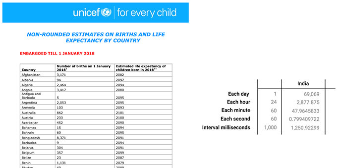
Then I found this report from UNICEF that contains how many babies are born in each country per day and applied this formula to find out which is the interval in milliseconds between one baby and the next one, for each country.
Finally, I built a hi-res prototype of a world map rank-colored with its odds and thenI added a blinking animation every time a child is born in a country. It is evident that babies are born more often in countries where they will have less odds to thrive.
The map was included at Bill Gates’ keynote as a connecting thread throughout the speech. And he -really- liked it.
Full Keynote: Goalkeepers 2019: Let's Change the Odds with Bill Gates
Type: Data Visualization
Tasks: Creative Technologist
Technologies: HTML, JavaScript, D3.js, CSS. Data source: UNICEF, IHME
Year: 2019
Type: Data Visualization
Tasks: Creative Technologist
Technologies: HTML, JavaScript, D3.js, CSS. Data source: UNICEF, IHME
Year: 2019
FedEx Lockers
FedEx realizes that customers aren't always home when they need to receive their packages. So they came to IA Collaborative looking for a solution to hold their packages in a secure location, close to their homes.
Team visited Texas where FedEx has existing lockers that are underused/malfunctioning and decided to bring this idea back.

My challenge was to construct 6 App-controlled lockers to be installed and tested during 2 days with 10 participants in Jewel Osco supermarkets around Chicago.
Participants could open a locker from an iPhone App by tapping a button on the phone's screen. The App used beacon technology located in different points of the store to authenticate the customer's location and serve as a geo-location guide.
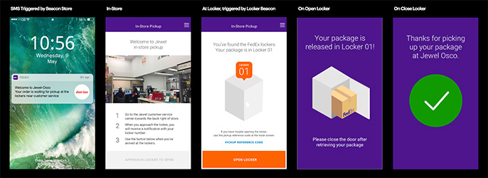
For the HW side of the project, I first built a paper prototype using HTTP Request. The final version used MQTT.
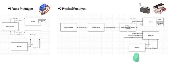
I used WIFI, NodeJS and MongoDB to to monitor the lockers' status remotely.
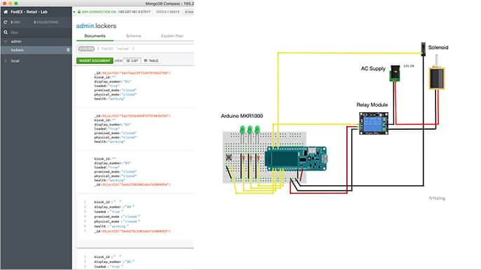
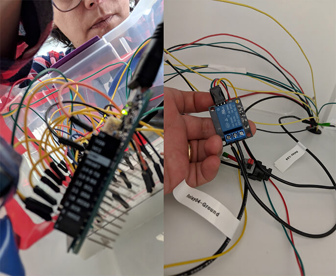
After the setup was ready, I built and ran a QA automation test 24/7.
The Research Study aimed to understand: user acceptance for iPhone vs. iPad interaction, user acceptance for Beacons technology, experience interaction design (physical and in-app).
Tasks: Creative Technologist: Front-End, Back-End, App, HW
Technologies: MongoDB, NodeJS, MQTT, Swift, Arduino, Latches, Limit Sensors, Beacons
Year: 2018
Technologies: MongoDB, NodeJS, MQTT, Swift, Arduino, Latches, Limit Sensors, Beacons
Year: 2018
The Faces of Facebook
1.2 billion of Facebook profile pictures collected in a single web page.
Playing around with Facebook API, I found a bug that allowed me to access the profile pictures of all Facebook users, so I put them together in a simple interface and published it.
Playing around with Facebook API, I found a bug that allowed me to access the profile pictures of all Facebook users, so I put them together in a simple interface and published it.
It became a worldwide sensation receiving 7M+ visits from all continents, broadcasted on TV programs, emitted on radio stations, published in printed newspapers and posted on more than 6,000 websites.
It was pretty overwhelming being interviewed all of a sudden by BBC India, LBC Lebanon and Middle East International TV, TN Argentina, German Radio Station MDR JUMP, Blu Radio Colombia, Radio Metro Argentina, El Pais Cali Newspaper, Semana Magazine, 20 minutes France, Spain, Switzerland and Mexico, AdvertisingAge, Creativity Online, CNET, Yahoo News, Google News, The Huffington Post Japan, MSN News, Wired, Mashable, The Verge, Gizmodo, BBC, CNN Tech, CNN Latino, DesignTaxi, and so on.
It was pretty overwhelming being interviewed all of a sudden by BBC India, LBC Lebanon and Middle East International TV, TN Argentina, German Radio Station MDR JUMP, Blu Radio Colombia, Radio Metro Argentina, El Pais Cali Newspaper, Semana Magazine, 20 minutes France, Spain, Switzerland and Mexico, AdvertisingAge, Creativity Online, CNET, Yahoo News, Google News, The Huffington Post Japan, MSN News, Wired, Mashable, The Verge, Gizmodo, BBC, CNN Tech, CNN Latino, DesignTaxi, and so on.
The homepage is a canvas of pixels that shows all the faces zoomed-out, organized in chronological order, from Mark Zuckerberg onward. Users can click on any pixel of the screen to zoom-in and get a 100x100px picture of that pixel and its surroundings, drag to navigate in any direction, and scroll down to zoom-out.
According to Facebook’s Legal Department, I shouldn't affirm that the order is chronological.

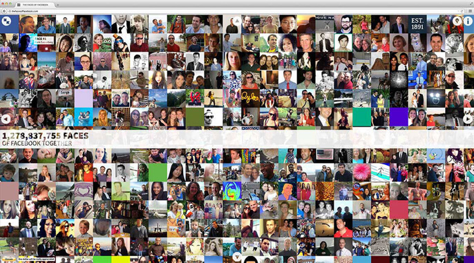
In zoom-in mode, users can click on any face to check that person's profile.
Sorry Mr. Sarode, it was a random pick and I hope you don’t mind.

Through the Pin button users optionally sign in via Facebook to pinpoint their picture on the page and see where they show up in relation to their friends.


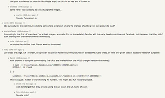
I received thousands of emails. Most of them media requests, many congratulating, some weird ones, several job offers, paid project proposals, and few threatening.
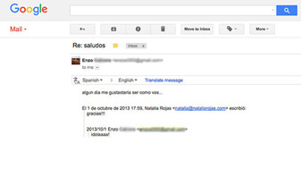
I want to share these two.
Jan from Germany: just 1 word.
"Someday I would like to be like you". From Enzo, an Argentinian kid.

In the meantime, the project was all over the news, the website was inaccessible to thousands of visitors due to 2 annoying issues.
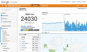
When the website reached 24K+ visits per second, the server collapsed for the 4th time in less than 5 days.
Hackers didn’t stop trying to hack the website. That is why I closed the project and stopped aggregating new profiles to the collage.
I learnt so many things from this project. Like this one: my name in Russian is Натали Рохас.

Type: Personal Project
Tasks: Creative Director + Designer + Front-end developer + Back-end developer
Technologies: HTML5 (canvas tag), Javascript, CSS, jQuery, EaselJS, Ajax, FB API, PHP and MySQL
Years: 2012, 2013
Tasks: Creative Director + Designer + Front-end developer + Back-end developer
Technologies: HTML5 (canvas tag), Javascript, CSS, jQuery, EaselJS, Ajax, FB API, PHP and MySQL
Years: 2012, 2013
Hamelin
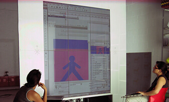
Out Of Home advertising display that attracts visitors and converts them into players of advergames. Upon entering Hamelin, users sees their silhouette integrated with the contents on the screen in front of them as a mirror. As they move, the silhouette moves.
Back in 2005 I co-founded Cuatic, a company specialized in Physical Interaction Installations. In 2008, supported by a €200K investment from risk capital, we created this product flagship product for the firm.
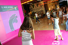
TV network La Sexta opened Hamelin to promote its program The Infernal Wall. Cuatic developed a game that recreated the contest program. The challenge of this game was to go across 10 walls, each one containing a different figure. Players must mimic the figure with their body and fit neatly into the figure of one of the wall, otherwise they lose and start again.
TV network La Sexta opened Hamelin to promote its program The Infernal Wall. Cuatic developed a game that recreated the contest program. The challenge of this game was to go across 10 walls, each one containing a different figure. Players must mimic the figure with their body and fit neatly into the figure of one of the wall, otherwise they lose and start again.
The Infernal Wall

Given the successful results, Hamelin was rented to other advertisers. For each advertiser we created a different advergame: interface, graphics, animations, copywriting, sound and vinyl.
Kandoo - Kids Wipes
This game was intended to reinforce the personal cleaning habits for kids. Children should explode the bubbles that contain elements related to the cleaning activity at the scene (the green ones) and avoid the red ones.
Raimat Wines
Visitors are asked to add instrumental notes to a base melody and compose a beautiful Christmas song. Each note is represented by a bunch of grapes placed on a pentagram and are added to the song by touching them.
Bones TV Program
Detectives have to reconstruct the skeleton by catching the missing bones and avoiding the ones already on the bed. It required special attention to the similar and small bones.
Alhambra Craft Beers
In a stand at skiing resort Sierra Nevada (Granada), the skier goes down the slope avoiding obstacles to reach the goal as fast as possible. Winners are rewarded with a warm gift.

We did several prototypes before building the final product.
First software prototype developed on proce55ing and Action Script.
Final software developed on openFrameworks and Action Script.

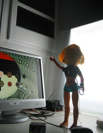
First hardware prototype, hello doll.
Second hardware prototype, at 1:1 scale AKA The Green Box.

Transporting and assembling Hamelin was a non-stop 24h odyssey.
Mounting the iron and steel pieces along with the methacrylate plates, transporting it with a toll, loading all the lights and electric system, setting the 9 screens and configuring them, gluing the vinyl, placing the computers, starting the software and adjusting the in-situ lighting parameters.
Cuatic won the Award of Best Entrepreneurial Project for Hamelin and its Business Plan at the 6th Contest of Banespyme-Orange organized by IE Business School Madrid, recognized as one of the leading business schools in the world that offers one of the most prestigious international MBA programs in the world.
Unfortunately the financial crisis hit Spain right before Cuatic signed the second round of financing.
Project: The Infernal Wall, Bones
Client: La Sexta TV Network
Agency: Bufete de Marketing
Project: Kandoo - Kids Wipes
Client: Procter & Gamble
Project: Alhambra Craft Beers
Client: Mahou-San Miguel
Agency: Comuniqar Consultores de Marketing
Client: La Sexta TV Network
Agency: Bufete de Marketing
Project: Kandoo - Kids Wipes
Client: Procter & Gamble
Project: Alhambra Craft Beers
Client: Mahou-San Miguel
Agency: Comuniqar Consultores de Marketing
Project: Alhambra Craft Beers
Client: Government of Catalonia
Agency: GroupM
Project: Raimat Wines
Client: Codorniu
Type: Physical Interaction Installation
Tasks: Inventor + Creative Director + Developer + Producer
With: Cuatic
Years: 2008, 2009
Client: Government of Catalonia
Agency: GroupM
Project: Raimat Wines
Client: Codorniu
Type: Physical Interaction Installation
Tasks: Inventor + Creative Director + Developer + Producer
With: Cuatic
Years: 2008, 2009
Roca Gallery Barcelona
Roca, the world leader in bathroom spaces, opens in 2009 a high-tech emblematic building in Barcelona as a brand experiential concept: a flagship building. The interior is equipped with interactive audiovisuals and lighting technology that immerse the visitor into a water-related atmosphere.
The building is designed by the prestigious studio of Carlos Ferrater and represents the past, present and future of the company. LED light is the protagonist of the façade, which is composed of just one material: glass. The inside, the use of light, audiovisuals, interactive resources and expositive elements entice the visitor to a personal, unique and sensory building experience.
Cuatic actively contributed with the ideation, user experience, coding, animation and construction of the Interactive Tables, Rituals, and the Interactive Catalogue.
Cuatic actively contributed with the ideation, user experience, coding, animation and construction of the Interactive Tables, Rituals, and the Interactive Catalogue.
Case Study
Interactive Tables
We converted 10 single-paged PPTs into 10 big scale interactive tables, each one composed by 3 joined tactile screens. Each table had its subject and specific gamma of colors within the sea range. All the tables had similar navigation: circular menus and submenus behaving like waves when touched. The content itself was displayed in several templates designed for huge amounts of dynamic information related to the brand: History, Leadership, Designers, Innovation, Sustainability, Compromise, Water, Sensations, Cultures, and Visionary Concepts. Meanwhile, aquatic forms appeared on the corners of the screen as decorative elements.
Rituals
It explores the conduct of the human being in the bathroom, in front of the mirror.We brush our teeth. We blow-dry our hair. We polish our outfit. We wear make-up. We take care of our body. We share moments with our partner. We look at our face and realize it reflects how we feel. Rituals are actions that help us to go through an emotional mode to a different one. Rituals make us feel good.
This interactive audiovisual reminds us the importance of those moments of intimacy in an 11m x 2m real life-size projection. The imaginary mirror that separates visitors from the protagonists on the screen is steamed up with a mist that flows naturally. Visitors can remove that mist just with their body movements.
This interactive audiovisual reminds us the importance of those moments of intimacy in an 11m x 2m real life-size projection. The imaginary mirror that separates visitors from the protagonists on the screen is steamed up with a mist that flows naturally. Visitors can remove that mist just with their body movements.
Interactive Catalogue is a 3-axis system controlled by movement of the hand on the air, to navigate a catalogue of bathroom products.
This was the most difficult project I have ever faced. After it was approved we went through months of blood, toil, tears, and sweat. Under extreme weather conditions and uncomfortable still in construction building, day and night, fighting for delivering our commitment, on time.
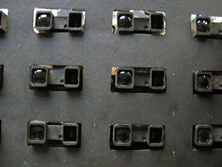
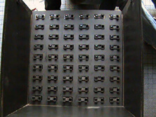
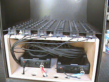
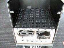
We organized a grid of 6 by 9 proximity sensors pointing upwards to deduce where the hand was in the 3D area.
The logic worked out but the information received from the sensors created a very noisy spot instead of an accurate point. That roadblock appeared in a very early stage of the production process and it took us a while to reduce that noise to its minimum.br>
Thanks to a talented team, we succeeded.
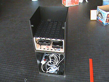
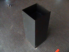
From the theory...
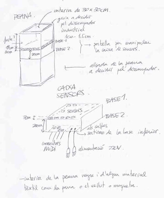
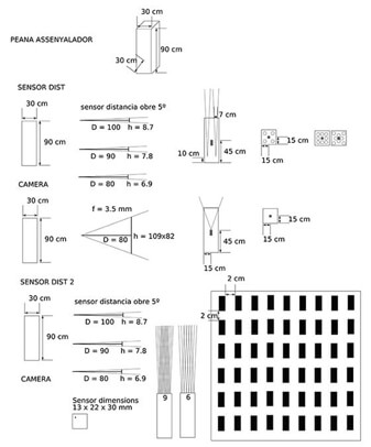
to the reality.
Type: Physical Interaction Installation
Client: Roca
Agency: Tiempo BBDO + Boolab
Project Director: Paul Freeth
Tasks: Creative Director + Developer + Co-producer
Technologies: Action Script, openFrameworks, OpenCV, mySQL, PHP
With: Cuatic
Year: 2009
Client: Roca
Agency: Tiempo BBDO + Boolab
Project Director: Paul Freeth
Tasks: Creative Director + Developer + Co-producer
Technologies: Action Script, openFrameworks, OpenCV, mySQL, PHP
With: Cuatic
Year: 2009
Volvo X-RAY
App to see through the car’s skin and discover its features. Volvos are designed to be intuitive. Uncluttered. Simple. As a result, a lot of the technology escapes the naked eye. This App turns iPhones and iPads into X-Ray scanners so users can see beneath its skin.
Users can walk around a Volvo and see a full 360° X-Ray view, with callouts to the patented World’s first Volvo innovations inside. It was launched at the Geneva Auto Show with huge success, and will be used in other Auto Shows around the world, as well as Volvo dealers.
Case Study
The App’s engine is an Augmented Reality software capable to recognize not only 1 (the usual) but 3 different AR markers at the same time and triangulates them.
The markers are strategically placed on the floor to position the X-Ray 3D model of the car in the exact position, angle and size of the real car. By diminishing the image of the real car and highlighting the X-Ray model, the magic happens.


The App also worked at the interior of the car when accommodated at the pilot’s seat.
Using the device’s compass to synchronize the model with the real car, users can point the device to any area of the car and will see it in X-Ray mode.

In both exterior and interior views, the 3D model had attached where the key features of the car are located. When tapped, they open catching short videos explaining that particular feature.
Park Assist
City Safety
We developed this project in a crazy time zone difference schedule with the collaboration of 7 different vendors all around the world: App (Munich and San Francisco), 3D model (Munich), 3D animations (Barcelona), Videos (Los Angeles), HTML content (Miami), Music and Sounds (Miami), UX (New York), and on top of the that, the client is in Gothenburg.
Type: Physical Interaction Installation & iPad + iPhone App
Client: Volvo
With: La Comunidad
Tasks: Creative Technologist + Co-producer
Technologies: Objective C
Year: 2012
Client: Volvo
With: La Comunidad
Tasks: Creative Technologist + Co-producer
Technologies: Objective C
Year: 2012
Physical Interaction Gallery
Mobile Apps & Online Gallery
Creative Code Gallery
Bio
Awards
Conferences & Talks & Press
The end is always a new beginning.
I bet you want to check out some other content.
So, unless you scroll up and get out of the end, this website is automatically going to the beginning in:
So, unless you scroll up and get out of the end, this website is automatically going to the beginning in:
10